Mostove na Doverieto
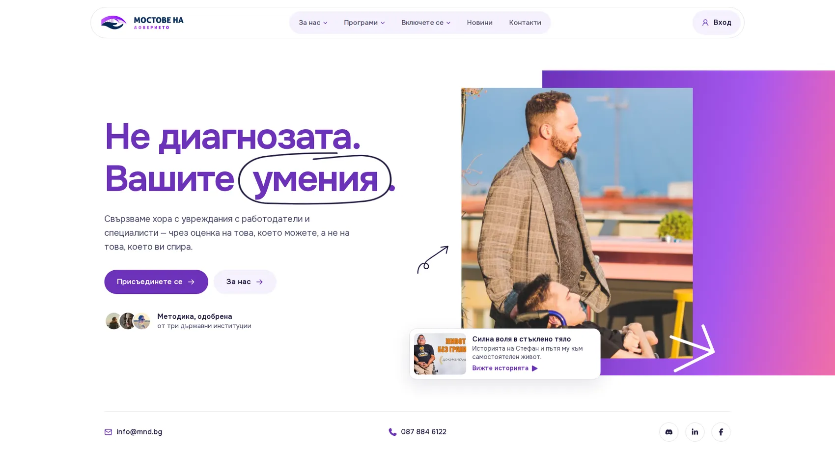
We created the website of the Bridges of Trust Foundation, which connects people with disabilities with employers and specialists by assessing skills rather than diagnoses.
Mostove na Doverieto
We created the website of the Mostove na Doverieto (Bridges of Trust) foundation, which connects people with disabilities with employers and specialists. Its mission is right there in the headline: “Not the diagnosis. Your skills.” The first screen asks “Where should we start?” and guides each visitor along their own path: a person seeking support, a volunteer, a donor or an employer. The path to employment is told in three clear steps (discovery, development and integration), and the story of Stefan and his “glass bones” gives the cause a human face. Answers to frequently asked questions, the sign-up form and the newsletter turn the site into a working tool for the foundation, not just a business card.
- Custom design
- UX/UI
- Web design
- Web development
- Front-end development
- Back-end development
- Optimization
- Hosting & maintenance
- Services
Branding
The mark is a bridge rising from an open palm. Support is literally the foundation the path stands on. Purple carries the buttons and accents, dark indigo holds the text and the dark sections, and sunny yellow highlights the numbers and calls to action.

Colors
White
HEX #FFFFFF
RGB 255,255,255
Lavender
HEX #F5F1FE
RGB 245,241,254
Purple
HEX #6C31B9
RGB 108,49,185
Sunny yellow
HEX #FEC84B
RGB 254,200,75
Indigo
HEX #1F1B41
RGB 31,27,65
Typography:
Onest
Aa, Bb, Cc, Dd, Ee, Ff, Gg, Hh, Ii, Jj, Kk, Ll, Mm, Nn, Oo, Pp, Qq, Rr, Ss, Tt, Uu, Vv, Ww, Xx, Yy, Zz
0 1 2 3 4 5 6 7 8 9 10

Design for every
device
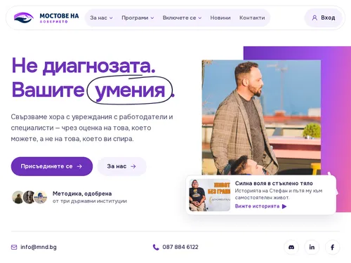
We design for each screen size separately — from a widescreen monitor to the phone in your pocket — so the experience is equally good everywhere.
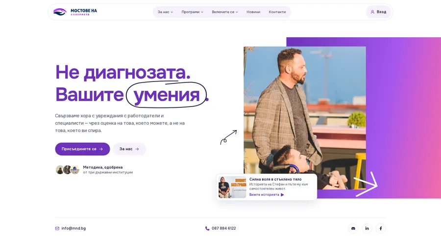
Over 22 pages
A clear structure and well-organized content in which visitors find what they're looking for on the first try.
Design for desktop and mobile
One design that looks and works equally well on a monitor, tablet and phone.
Easy to use
Intuitive navigation and fast loading — nothing standing between the customer and the action.
Every view is tested on real devices before launch — because mobile traffic has long been the main traffic, not the extra.
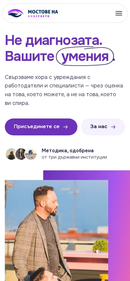
Built with the mobile screen in mind
Over 70% of visits come from a phone. That's why we start there — and build up to tablet and desktop, instead of shrinking a finished desktop design.
Every screen is checked on a real device, not just in a browser. That way, differences are caught before launch, not after it.

Scroll the screen in the phone — this is the project's real mobile version, exactly as the client sees it.
Phone first, then everything else
We design from the smallest screen up. That way, what matters most stays visible everywhere, instead of being hastily rearranged for mobile.
Fast, even on a weak connection
We optimize images and code for mobile networks. The page starts loading in under a second — not after the visitor has already given up.
Thumb-friendly
Buttons, forms and navigation are designed for one-handed use on the go — no zooming, no accidental taps.
Project timeline
The work proceeds in clear phases with a fixed scope — you know what happens in each one and when to expect the result.
Phase 1 1 week
ResearchStructureCompetitor analysisPhase 2 2 weeks
Custom designUX/UIWeb designPhase 3 2 weeks
Web developmentFront-end developmentBack-end developmentPhase 4 1 week
OptimizationHosting & maintenanceMore projects
All projects
Komarov Consult
We built the new website of the accounting firm Komarov Consult — over 30 years of accounting, tax consulting and company registration in Varna.
Giar
We designed the corporate website of Giar Outdoor Media — an established company with over 15 years of experience managing advertising structures in Varna and the region.