Nestra
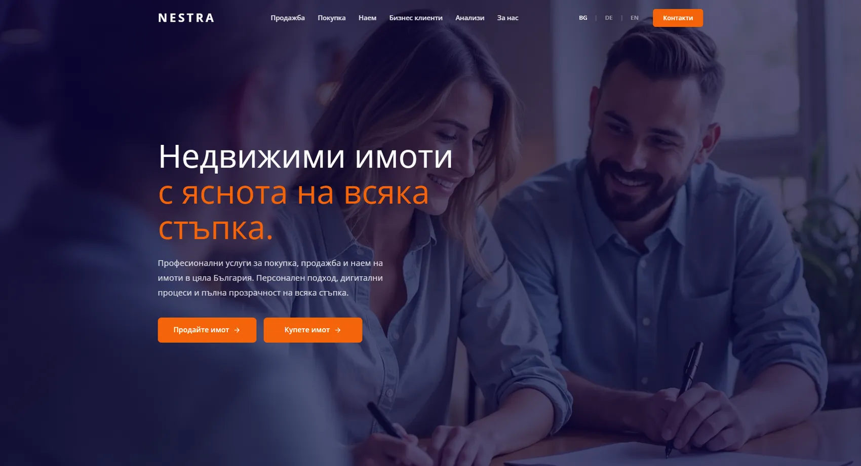
We designed the website of the Nestra agency — real estate across Bulgaria, with clearly separated services for sales, purchases and rentals.
Nestra
We designed the website of Nestra — a real estate agency covering all of Bulgaria, with clearly separated services for selling, buying and renting. The agency stands out for the way it works, not for the number of listings, so the website starts from the process: hand-picked local agents, digitally organized steps and personal accountability for every deal. The two main paths — “sell a property” and “buy a property” — sit side by side right from the start, because owners and buyers look for different things and shouldn't have to go through the same content. The website works in three languages, including for business clients and investors.
- Custom design
- UX/UI
- Web design
- Web development
- Back-end development
- Optimization
- Front-end development
- Interactive map
- Hosting & maintenance
- Real estate
Branding
The brand is just a name, set with wide letter spacing — so calm that it competes with nothing on the screen. Navy blue carries trust, orange is reserved solely for actions, and between them there is empty space, which is also the agency's promise: clarity at every step.

Colors
White
HEX #FFFFFF
RGB 255,255,255
Peach
HEX #FDE3C8
RGB 253,227,200
Orange
HEX #F56309
RGB 245,99,9
Indigo
HEX #201B43
RGB 32,27,67
Navy blue
HEX #130C36
RGB 19,12,54
Typography:
Open Sans
Aa, Bb, Cc, Dd, Ee, Ff, Gg, Hh, Ii, Jj, Kk, Ll, Mm, Nn, Oo, Pp, Qq, Rr, Ss, Tt, Uu, Vv, Ww, Xx, Yy, Zz
0 1 2 3 4 5 6 7 8 9 10

Design for every
device
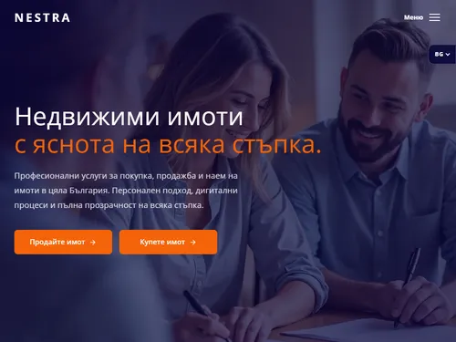
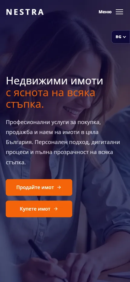
We design for each screen size separately — from a widescreen monitor to the phone in your pocket — so the experience is equally good everywhere.
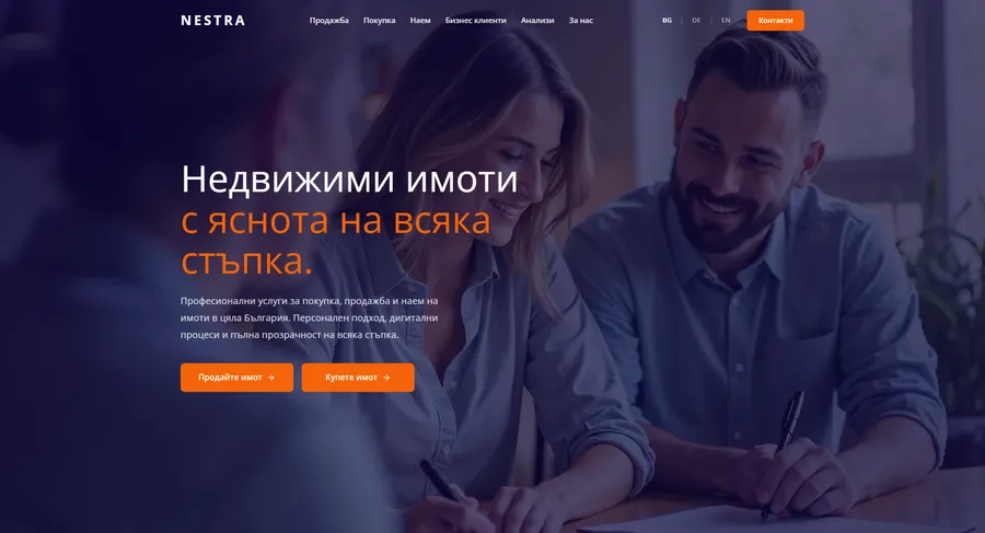
Over 22 pages
A clear structure and well-organized content in which visitors find what they're looking for on the first try.
Design for desktop and mobile
One design that looks and works equally well on a monitor, tablet and phone.
Easy to use
Intuitive navigation and fast loading — nothing standing between the customer and the action.
Every view is tested on real devices before launch — because mobile traffic has long been the main traffic, not the extra.
Built with the mobile screen in mind
Over 70% of visits come from a phone. That's why we start there — and build up to tablet and desktop, instead of shrinking a finished desktop design.
Every screen is checked on a real device, not just in a browser. That way, differences are caught before launch, not after it.

Scroll the screen in the phone — this is the project's real mobile version, exactly as the client sees it.
Phone first, then everything else
We design from the smallest screen up. That way, what matters most stays visible everywhere, instead of being hastily rearranged for mobile.
Fast, even on a weak connection
We optimize images and code for mobile networks. The page starts loading in under a second — not after the visitor has already given up.
Thumb-friendly
Buttons, forms and navigation are designed for one-handed use on the go — no zooming, no accidental taps.
Project timeline
The work proceeds in clear phases with a fixed scope — you know what happens in each one and when to expect the result.
Phase 1 1 week
ResearchStructureCompetitor analysisPhase 2 2 weeks
Custom designUX/UIWeb designPhase 3 2 weeks
Web developmentBack-end developmentFront-end developmentInteractive mapPhase 4 1 week
OptimizationHosting & maintenanceMore projects
All projects
Varna Home Center
Varna Home Center is a real estate agency in Varna with over 17 years of experience, and we built their new website — with property search right on the first screen and verified listings organized around what the buyer is looking for.
Tarnovo Brokers
We built the website of Tarnovo Brokers, a real estate agency in Veliko Tarnovo with licensed brokers and over 15 years of experience in the region.