Shiko
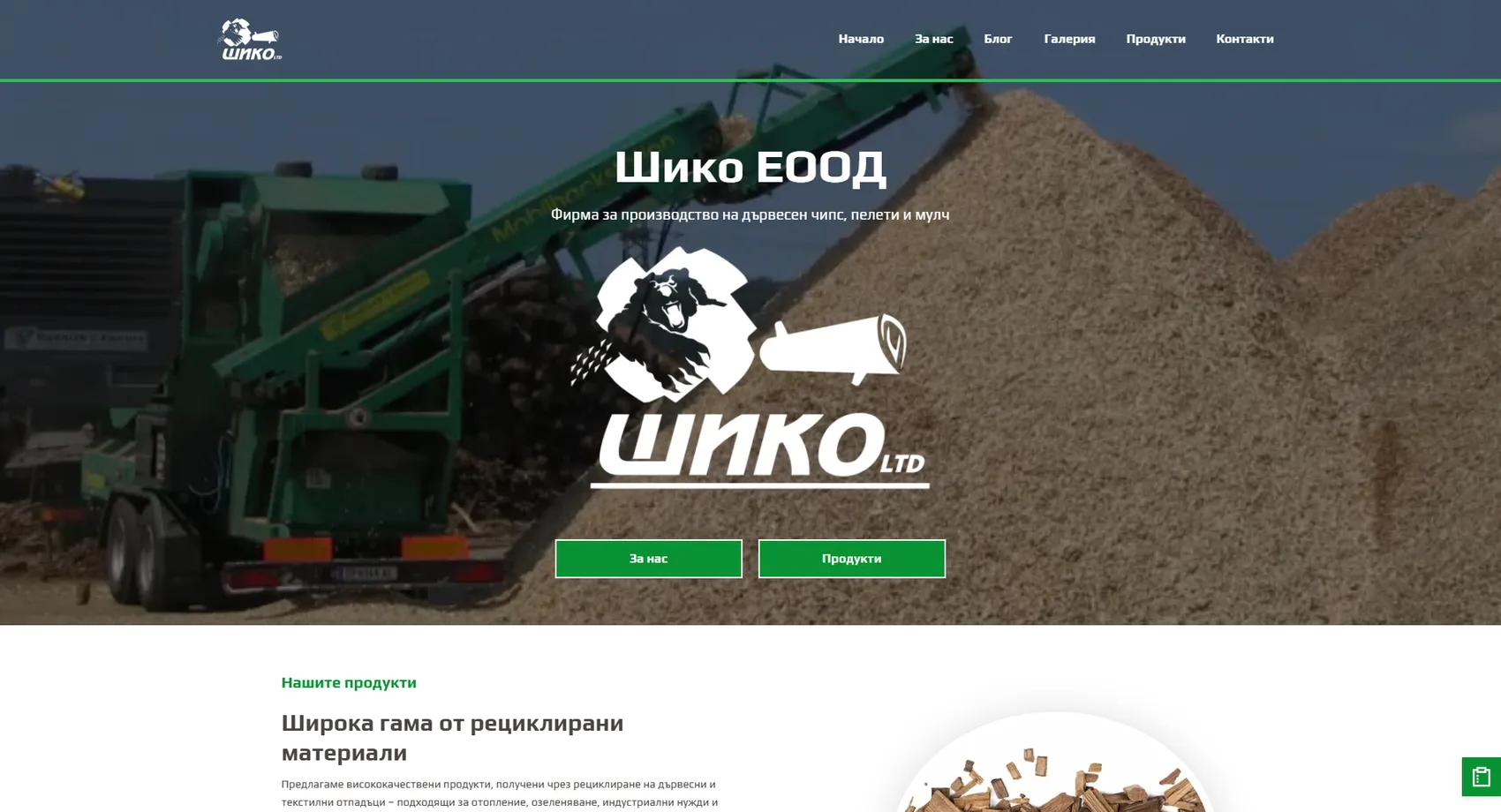
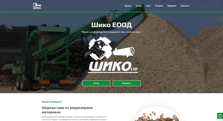
We developed the website of SHIKO EOOD — a company founded in 1991 that recycles wood and textile waste into chips, pellets, mulch and absorbents.
Shiko
We developed the website of SHIKO EOOD — a company founded in 1991 that recycles wood and textile waste into chips, pellets, mulch and absorbents. The products are bought by different people for different reasons — pellets for heating, colored mulch for landscaping, cotton absorbents for industrial safety — so each one is presented through its application rather than as a line in a list. More than thirty years of experience, an in-house transport fleet and the volumes of material processed are shown in numbers, because when delivering by the pallet, that is the argument that counts with municipalities and industrial clients. The inquiry form also asks for the number of pallets, so the conversation starts straight from the quote.
- Custom design
- UX/UI
- Web design
- Web development
- Back-end development
- Optimization
- Front-end development
- Hosting & maintenance
- Manufacturing
Branding
The mark is a bear feeding wood into a machine — the production process told in a single picture, the way it used to be painted on trucks. The logo is white and lives on photos from the site yard, while green carries the buttons and headings, because the whole business is recycling.

Colors
White
HEX #FFFFFF
RGB 255,255,255
Mint
HEX #E4F3EB
RGB 228,243,235
Light green
HEX #2CBF5A
RGB 44,191,90
Green
HEX #089233
RGB 8,146,51
Steel
HEX #3E4F63
RGB 62,79,99
Typography:
Play
Aa, Bb, Cc, Dd, Ee, Ff, Gg, Hh, Ii, Jj, Kk, Ll, Mm, Nn, Oo, Pp, Qq, Rr, Ss, Tt, Uu, Vv, Ww, Xx, Yy, Zz
0 1 2 3 4 5 6 7 8 9 10

Design for every
device
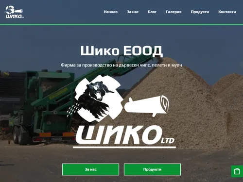
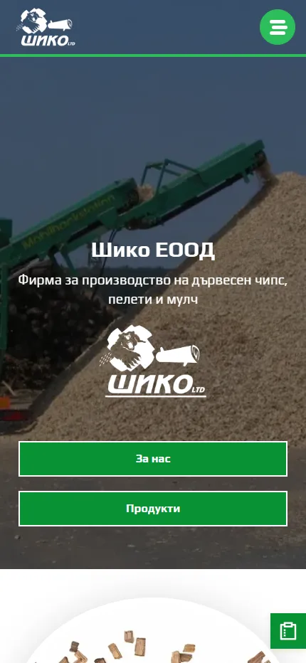
We design for each screen size separately — from a widescreen monitor to the phone in your pocket — so the experience is equally good everywhere.
Over 22 pages
A clear structure and well-organized content in which visitors find what they're looking for on the first try.
Design for desktop and mobile
One design that looks and works equally well on a monitor, tablet and phone.
Easy to use
Intuitive navigation and fast loading — nothing standing between the customer and the action.
Every view is tested on real devices before launch — because mobile traffic has long been the main traffic, not the extra.
Built with the mobile screen in mind
Over 70% of visits come from a phone. That's why we start there — and build up to tablet and desktop, instead of shrinking a finished desktop design.
Every screen is checked on a real device, not just in a browser. That way, differences are caught before launch, not after it.

Scroll the screen in the phone — this is the project's real mobile version, exactly as the client sees it.
Phone first, then everything else
We design from the smallest screen up. That way, what matters most stays visible everywhere, instead of being hastily rearranged for mobile.
Fast, even on a weak connection
We optimize images and code for mobile networks. The page starts loading in under a second — not after the visitor has already given up.
Thumb-friendly
Buttons, forms and navigation are designed for one-handed use on the go — no zooming, no accidental taps.
Project timeline
The work proceeds in clear phases with a fixed scope — you know what happens in each one and when to expect the result.
Phase 1 1 week
ResearchStructureCompetitor analysisPhase 2 2 weeks
Custom designUX/UIWeb designPhase 3 2 weeks
Web developmentBack-end developmentFront-end developmentPhase 4 1 week
OptimizationHosting & maintenanceMore projects
All projects
AgricultureBulgaria
We developed the four-language website of AgricultureBulgaria — a Bulgarian company specializing in producing and growing high-quality agricultural products for export.
BIOSA
We developed the website of BIOSA Ltd. — an importer of technological equipment for the food and agricultural industries.